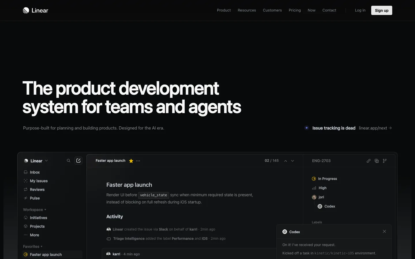
pagevspage.com
// audit v1 · linear.app vs asana.com
report/linear.app__vs__asana.com.json
pass
// verdict

Linear wins decisively — its page is built around a specific, defensible identity ('A new species of product tool') while Asana's page is a bloated category-speak machine that could belong to any enterprise SaaS from 2019.

delta
linear.app +16
audit.json
5 dimensions

Headline Clarity

linear.app leads +14
0
a · linear.app
050100
A · linear.app 72
B · asana.com 58
linear.app leads by 14// 0–40 weak · 40–60 tie · 60–100 strong
0
b · asana.com
// analysis

Linear's H1 — 'The product development system for teams and agents' — earns points for specificity: it names both the audience ('teams') and the emerging use case ('agents') in one breath. The subhead sharpens it further: 'Purpose-built for planning and building products.

Designed for the AI era.' That phrase 'Designed for the AI era' is doing real positioning work in 2025. The weakness is that 'system' is abstract — a first-time visitor still can't picture what they're buying in under 2 seconds.

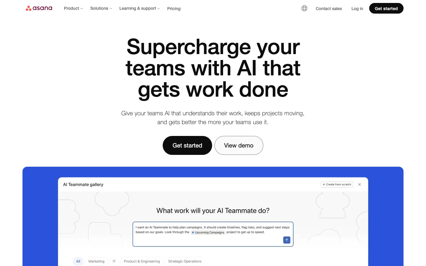
Asana's H1 — 'Supercharge your teams with AI that gets work done' — is pure filler. 'Supercharge' is a word that has appeared on approximately 40,000 SaaS homepages.

The follow-up 'The platform for human + AI collaboration' is a category label, not a promise. Neither headline tells you what Asana actually does differently from Monday, Notion, or ClickUp.

steal this

Replace Asana's H1 'Supercharge your teams with AI that gets work done' with a format that mirrors Linear's specificity: name the audience and the concrete outcome, e.g., 'The work management platform for marketing, ops, and IT teams — now with AI that runs your workflows automatically.'

Value Proposition

linear.app leads +31
0
a · linear.app
050100
A · linear.app 75
B · asana.com 44
linear.app leads by 31// 0–40 weak · 40–60 tie · 60–100 strong
0
b · asana.com
// analysis

Linear's value prop is built around a genuine differentiator: 'A new species of product tool. Purpose-built for modern teams with AI workflows at its core.' The phrase 'Issue tracking is dead' — dropped as a provocative aside — is the most memorable line on either page.

It signals a point of view, not just a feature list. The three pillars (

// items
  • 01'Built for purpose,'
  • 02'Powered by AI agents,'
  • 03'Designed for speed'

) are specific enough to be defensible. Asana's differentiators are a graveyard of vague claims:

// items
  • 01'Amplify your impact with AI,'
  • 02'More clarity and accountability,'
  • 03'Stay secure and compliant.'

The only number on the page — '85% of Fortune 100 companies choose Asana' — is footnoted with 'Accurate as of December 2023, includes free and paid users,' which quietly admits the stat is stale and padded. No pricing is surfaced on either page, but Asana's complete absence of any pricing signal is a harder miss given its enterprise positioning.

steal this

Asana buries its sharpest claim in a footnote. Pull '85% of Fortune 100 companies' out of the footnote and put it in the hero subhead, then add a specific outcome: '85% of Fortune 100 companies use Asana to ship campaigns, onboard employees, and hit OKRs — without the spreadsheet chaos.' Drop the December 2023 hedge or update the stat.

CTA Strength

linear.app leads +7
0
a · linear.app
050100
A · linear.app 55
B · asana.com 48
linear.app leads by 7// 0–40 weak · 40–60 tie · 60–100 strong
0
b · asana.com
// analysis

Linear's primary CTA is 'Get started' linking to /signup — generic, no friction-killing copy, no answer to 'what happens when I click this.' The secondary 'Contact sales' is appropriately placed but the page also surfaces a bizarre graveyard of UI-element CTAs:

// items
  • 01'Listen,'
  • 02'Faster app launch,'
  • 03'Performance,'
  • 04'iOS,'
  • 05'Linear,'
  • 06'Inbox'

— these are interactive product demos leaking into the CTA inventory and creating noise. Asana's primary CTA is also 'Get started' linking to /create-account, which is equally generic.

Asana does add 'View demo' as a secondary option, which is a meaningful friction reducer — but the page also opens with a cookie consent modal that fires

// items
  • 01'Allow All,'
  • 02'Apply,'
  • 03'Cancel,'
  • 04'Confirm My Choices'

as the first four CTAs a visitor encounters. That's a conversion killer before the hero even loads.

steal this

Linear: change 'Get started' to 'Start free — no credit card' and add a one-line subhead beneath the button: 'Your first workspace is ready in 60 seconds.' This mirrors Asana's 'View demo' move by reducing perceived commitment, but goes further by answering the time-cost objection directly.

Social Proof

linear.app leads +9
0
a · linear.app
050100
A · linear.app 62
B · asana.com 53
linear.app leads by 9// 0–40 weak · 40–60 tie · 60–100 strong
0
b · asana.com
// analysis

Linear's social proof is embedded in product UI screenshots rather than traditional logos-and-testimonials. The animated demo showing 'Linear created the issue via Slack on behalf of karri · 2min ago' and 'Triage Intelligence added the label Performance and iOS · 2min ago' is clever — it shows the product working, not just claims about it.

The '5.0 Monitor' rating snippet and the cycle-time charts ('Cycle time by agent: Cursor, Codex, No Agent') are specific and verifiable. The weakness: no customer logos, no named testimonials, no user counts.

Asana has the opposite problem: it name-drops 'The world's top companies trust Asana' with a logo wall, cites 'more than 12,000 user reviews' on G2, claims 'A Leader in The Forrester Wave: Collaborative Work Management Tools 2025' and 'A Leader in the 2025 Gartner Magic Quadrant' — but the one actual testimonial on the page is from 'Simon Levinson, Global Digital Manufacturing Process Innovation Manager, Danone,' which is so niche it will resonate with approximately zero percent of visitors who aren't in global digital manufacturing process innovation.

steal this

Linear should add a single stat above the fold — something like '10,000+ product teams including [3 recognizable logos]' — to give first-time visitors an instant trust anchor before they engage with the product demo. The demo is compelling but it's not a substitute for social proof; it's a complement to it.

Visual Hierarchy

linear.app leads +17
0
a · linear.app
050100
A · linear.app 74
B · asana.com 57
linear.app leads by 17// 0–40 weak · 40–60 tie · 60–100 strong
0
b · asana.com
// analysis
// dom order
01Linear's DOM order tells a coherent story: H1 states the category
02subhead adds the differentiator
03'Issue tracking is dead' provokes
04product demo shows the AI workflow in action
05four feature sections ('Make product operations self-driving,' 'Define the product direction,' 'Move work forw

ard,' 'Review PRs and agent output') build the case sequentially. The eye is guided from claim to proof to proof to proof.

The clutter comes from the interactive demo elements bleeding into the CTA list. Asana's hierarchy is fractured from the first pixel: the cookie consent modal fires before the hero, the nav has five top-level items with dropdowns, and the page structure jumps from 'Supercharge your teams' to a tab carousel of use cases to 'What sets Asana apart' to an integration count to a logo wall to a single testimonial to analyst badges — with no through-line.

The section 'Get started easily' appears near the bottom and contains four different entry points (

// items
  • 01'Try the Asana demo,'
  • 02'See Asana in action,'
  • 03'Discover resources,'
  • 04'Start with a template'

), which is four too many for a single CTA section.

steal this

Asana's 'Get started easily' section with four competing options should be collapsed to one: the highest-converting entry point (likely 'Try the Asana demo' based on its placement). Add a single line of copy beneath it explaining what the demo shows and how long it takes: 'A 3-minute interactive tour — no login required.'