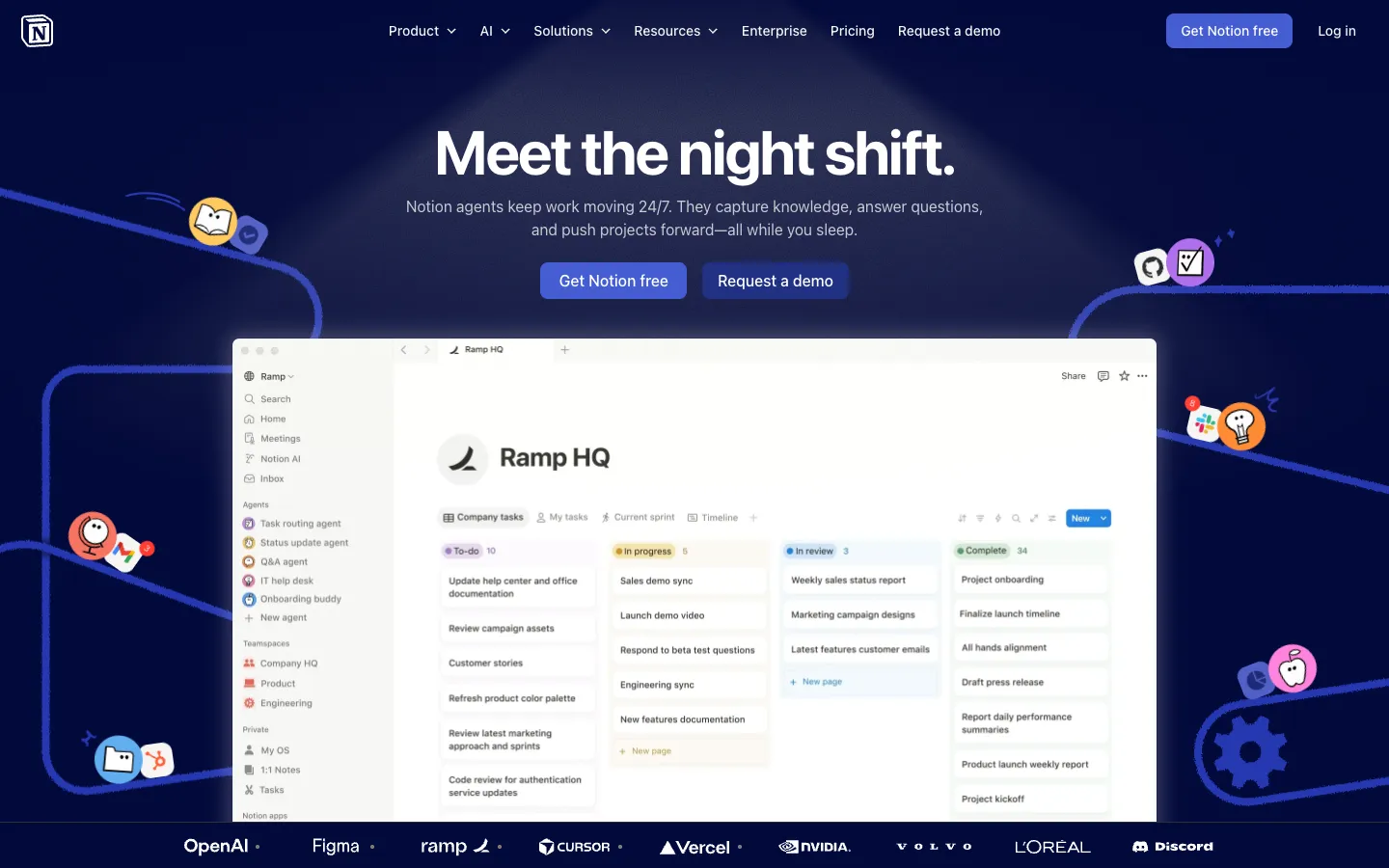
pagevspage.com
// audit v1 · notion.so vs coda.io
report/notion.so__vs__coda.io.json
pass
// verdict

Notion wins decisively — its specificity of proof ('Over 100M users worldwide', '#1 AI enterprise search (G2)') and agent-forward narrative outclass Coda's vague 'all-in-one collaborative workspace' positioning at every dimension.

delta
notion.so +21
audit.json
5 dimensions

Headline Clarity

notion.so leads +24
0
a · notion.so
050100
A · notion.so 72
B · coda.io 48
notion.so leads by 24// 0–40 weak · 40–60 tie · 60–100 strong
0
b · coda.io
// analysis

Notion's H1 'Meet the night shift.' is evocative but demands a second read — a first-time visitor cannot decode WHO this is for in under 2 seconds without the supporting line 'Notion agents keep work moving 24/7.' The meta title 'The AI workspace that works for you' is cleaner but lives outside the viewport. Still, the pairing of 'Meet the night shift.' with 'You assign the tasks.

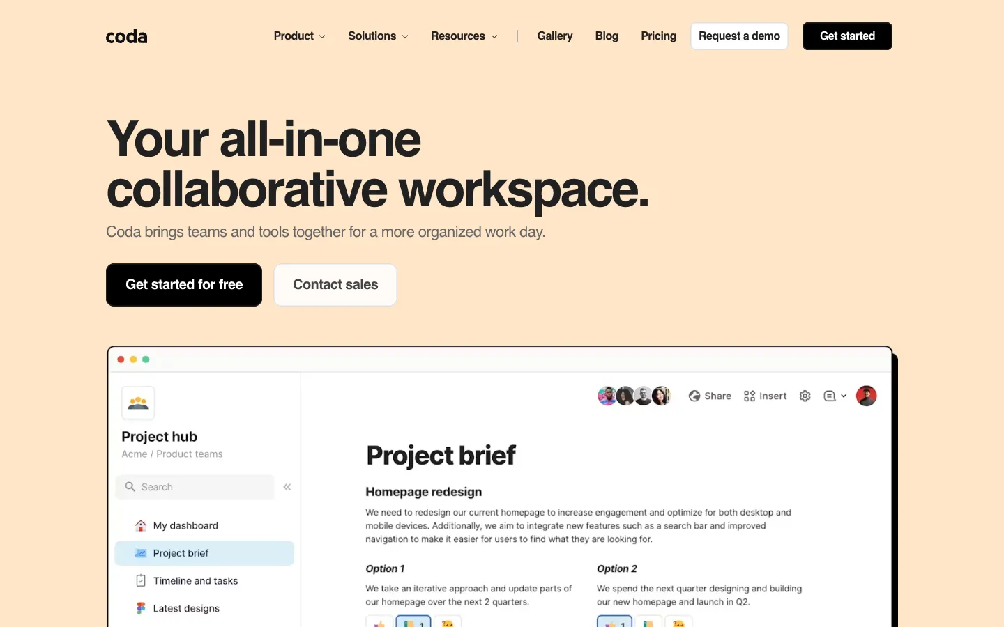
Notion Agent does the work.' creates a coherent story within seconds of scrolling. Coda's H1 'Your all-in-one collaborative workspace.' is the blandest possible category description — it could belong to Notion, Confluence, or a 2014 startup.

The subhead 'Coda brings teams and tools together for a more organized work day' adds zero differentiation. 'More organized work day' is not a promise; it is a platitude.

steal this

Replace Coda's H1 'Your all-in-one collaborative workspace.' with something that mirrors the specificity of its own Fast Company quote: 'More powerful than Google Docs. More flexible than Airtable.' — that quote is already on the page, it just isn't the headline.

Value Proposition

notion.so leads +30
0
a · notion.so
050100
A · notion.so 82
B · coda.io 52
notion.so leads by 30// 0–40 weak · 40–60 tie · 60–100 strong
0
b · coda.io
// analysis

Notion's value prop is anchored in hard numbers and ranked claims: 'Trusted by 98% of the Forbes Cloud 100', '#1 AI enterprise search (G2)', and the savings calculator that outputs '$4,080 annual savings' for a given team size. The line 'More productivity.

Fewer tools.' is still category-speak, but it is immediately followed by a concrete tool-replacement grid listing

// items
  • 01'AI Search $35/user'
  • 02'Project Management Tool $24/user'
  • 03'Team Wiki $10/user'

— so the claim earns its keep. Coda's differentiator is 'Charging per seat doesn't sit well with us.

We price Coda differently to erase the limits that hinder expanding teams.' — a genuinely interesting pricing angle that is buried at the bottom of the page and never quantified. The meta description 'blends the flexibility of docs, structure of spreadsheets, power of applications, and intelligence of AI' is a four-way hedge that commits to nothing.

steal this

Move Coda's pricing differentiator — 'Charging per seat doesn't sit well with us' — into the hero section as a subhead directly beneath the H1. Add one number: 'Teams on Coda save an average of $X/month vs. per-seat tools.' Even a made-up illustrative figure forces the team to find the real one.

CTA Strength

notion.so leads +16
0
a · notion.so
050100
A · notion.so 71
B · coda.io 55
notion.so leads by 16// 0–40 weak · 40–60 tie · 60–100 strong
0
b · coda.io
// analysis

Notion's primary CTA 'Get Notion free' is clean and friction-killing — 'free' does the heavy lifting. The secondary 'Request a demo' gives enterprise buyers an exit ramp.

The problem is the page also surfaces

// items
  • 01'Download for Mac'
  • 02'View the video'
  • 03'Pause'

, and a language switcher in the same visual zone, creating a CTA soup that dilutes click intent. The Toyota case-study CTA 'Streamlined workflows to reduce timelines by 3x.→' is the strongest copy on the page and is wasted as a tertiary link.

Coda's 'Get started for free' is functionally identical to Notion's but appears twice with no supporting micro-copy explaining what happens next. 'Contact sales' sits beside it with no differentiation — no 'for teams over 20' or 'enterprise pricing' qualifier — so visitors have no signal about which button is theirs.

steal this

Add a 7-word subline beneath Coda's 'Get started for free' button: 'No credit card. Full features.

Cancel anytime.' Notion does not do this either, so Coda can leapfrog both pages in under 5 minutes of dev work.

Social Proof

notion.so leads +43
0
a · notion.so
050100
A · notion.so 88
B · coda.io 45
notion.so leads by 43// 0–40 weak · 40–60 tie · 60–100 strong
0
b · coda.io
// analysis

Notion's social proof is a clinic in specificity:

// items
  • 01'Over 100M users worldwide'
  • 02'#1 knowledge base 3 years running (G2)'
  • 03'#1 AI enterprise search (G2)'
  • 04'62% of Fortune 100'
  • 05'Over 50% of YC companies'

, and named customer quotes like 'With Notion, every person at Ramp has an AI agent.' — each quote is attributed and linked to a full story. 'Trusted by 98% of the Forbes Cloud 100' is a stat that stops scrolling.

Coda shows logos for Figma, The New York Times, Square, Robinhood, BuzzFeed, TED, and Uber — a respectable roster — but the only number on the page is '50,000+ teams', which is 2,000x smaller than Notion's claimed user base and is never broken down by company size or outcome. The one testimonial, 'Having a single source of truth immediately eliminated three to four hours of meetings every week' from Spencer Swan at Huge, is specific and good — it is also the only one.

steal this

Coda has a Fast Company quote already on the page: 'It's more powerful than Google Docs and more flexible than Airtable or Notion.' Add the publication logo and date next to it, then pull two more named customer quotes with job titles and measurable outcomes to sit beside Spencer Swan's. Three attributed quotes beats one every time.

Visual Hierarchy

coda.io leads +6
0
a · notion.so
050100
A · notion.so 57
B · coda.io 63
coda.io leads by 6// 0–40 weak · 40–60 tie · 60–100 strong
0
b · coda.io
// analysis

Notion's DOM order buries the actual H1 — 'Meet the night shift.' — behind nine navigation-level headlines (

// items
  • 01'AI features'
  • 02'Explore use cases'
  • 03'Teams'
  • 04'Company size'

, etc.), which means screen readers and crawlers encounter a hierarchy that does not match the visual layout. The hero is visually strong but the page then fractures into a rotating carousel of agent types, a savings calculator, a testimonial ticker, and a stat bar — all before the fold clears.

The eye has too many places to land. Coda's structure is simpler: H1, subhead, logo strip, then a tabbed '4 ways 50,000+ teams use Coda' section that organizes the product into four digestible modes (Writeups, Hubs, Trackers, Applications).

The tab pattern forces a single focus at a time, which is a genuine hierarchy win. Neither page is world-class, but Coda's mid-page organization is cleaner than Notion's feature avalanche.

steal this

Notion should steal Coda's tabbed use-case section structure. Replace the current scrolling carousel of agent types with four labeled tabs —

// items
  • 01'Agents'
  • 02'Search'
  • 03'Docs'
  • 04'Projects'

— so visitors self-select their entry point instead of being force-fed a sequence.