pagevspage.com
// audit v1 · stripe.com vs paddle.com
report/stripe.com__vs__paddle.com.json
pass
// verdict

Stripe wins on authority and infrastructure credibility, but its homepage tries to be everything to everyone while Paddle's sharper MoR positioning would convert SaaS founders faster if it weren't undermined by a weak headline and thin social proof.

delta
stripe.com +14
audit.json
5 dimensions

Headline Clarity

stripe.com leads +14
0
a · stripe.com
050100
A · stripe.com 72
B · paddle.com 58
stripe.com leads by 14// 0–40 weak · 40–60 tie · 60–100 strong
0
b · paddle.com
// analysis

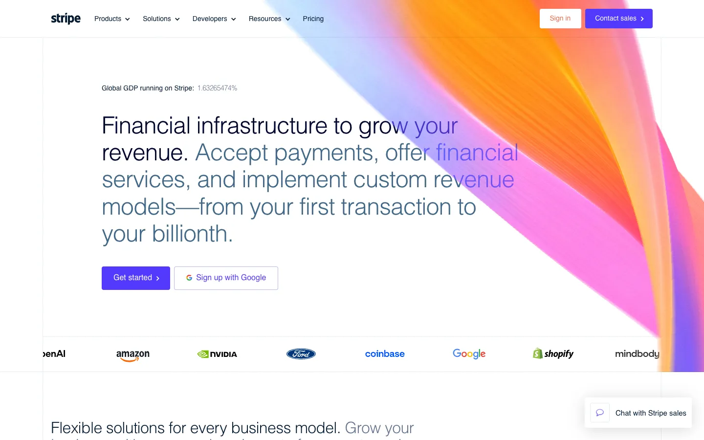
Stripe's H1 — 'Financial infrastructure to grow your revenue' — is polished but deliberately broad. The subhead does the heavy lifting: 'Accept payments, offer financial services, and implement custom revenue models—from your first transaction to your billionth.' That 'first transaction to your billionth' range signals scale but also signals that Stripe is not speaking to anyone in particular.

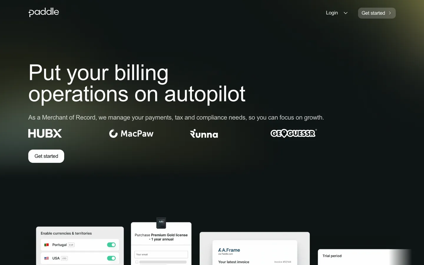
Paddle's H1 — 'Put your billing operations on autopilot' — is punchy but tells a first-time visitor nothing about who this is for. The subhead 'As a Merchant of Record, we manage your payments, tax and compliance needs, so you can focus on growth' is actually the more specific and differentiated claim, but it's buried one line below the fold of attention.

Stripe at least earns its vagueness with brand recognition; Paddle cannot.

steal this

Paddle: Rewrite your H1 to 'Put SaaS billing on autopilot — we handle tax, compliance, and payments as your Merchant of Record' so the MoR differentiator is in the headline, not the subhead.

Value Proposition

stripe.com leads +10
0
a · stripe.com
050100
A · stripe.com 75
B · paddle.com 65
stripe.com leads by 10// 0–40 weak · 40–60 tie · 60–100 strong
0
b · paddle.com
// analysis

Stripe backs its value prop with hard numbers that are genuinely impressive:

// items
  • 01'$1.9T in payments volume processed in 2025'
  • 02'135+ currencies and payment methods supported'
  • 03'99.999% historical uptime for Stripe services'

. The stat 'Global GDP running on Stripe: 1.63265474%' is a bold, specific, screenshot-worthy claim.

Paddle's differentiator — the Merchant of Record model — is legitimately defensible and rare, but the page leans on outcome stats like '3X ARR growth' and '$100,000+ recovered in 72 days' without explaining the mechanism clearly enough for a skeptical CFO. The pricing hint 'ProfitWell MetricsFreeReal-time subscription analytics, 100% free' is a strong hook that goes completely unexploited in the hero section.

steal this

Paddle: Add a single line under your MoR subhead that reads: 'We remitted $89 million in sales taxes last year so our customers didn't have to file a single return.' That number is already on your page — move it up.

CTA Strength

stripe.com leads +2
0
a · stripe.com
050100
A · stripe.com 62
B · paddle.com 60
stripe.com leads by 2// 0–40 weak · 40–60 tie · 60–100 strong
0
b · paddle.com
// analysis

Stripe's primary CTA is 'Get started' pointing to dashboard.stripe.com/register, with a secondary 'Sign up with Google' — the Google OAuth option is a genuine friction-killer. But the page also surfaces

// items
  • 01'Contact sales'
  • 02'Watch video'
  • 03'Get the data'
  • 04'Get the report'
  • 05'Join us at Sessions'
  • 06'Read the letter'

all in the same visual zone, creating a CTA graveyard.

// dom order
01Paddle's primary CTA is 'Get started' (
02/get-started) with a secondary 'Book a demo' (
03/demo) — a clean two-track funnel for self-serve vs

. enterprise. Neither page answers 'what happens when I click this.' Stripe's 'Get started' could mean anything; Paddle's 'Book a demo' at least implies a human conversation, but the button copy itself is generic.

steal this

Stripe: Trim the hero CTA cluster to two buttons. Rename 'Get started' to 'Start accepting payments — free' to mirror the specificity of 'Sign up with Google' and kill the ambiguity about what registration actually unlocks.

Social Proof

stripe.com leads +27
0
a · stripe.com
050100
A · stripe.com 82
B · paddle.com 55
stripe.com leads by 27// 0–40 weak · 40–60 tie · 60–100 strong
0
b · paddle.com
// analysis

Stripe's social proof is dense and credible: '50% of Fortune 100 companies have used Stripe', named enterprise case studies with specific metrics ('Hertz unifies commerce with Stripe', 'URBN consolidates $5 billion in online and in-store revenue onto Stripe'), and the macro stat '$1.9T in payments volume processed in 2025'. The logo section is unusual — Stripe uses its own parallelogram logo reimagined in real-world photography rather than customer logos, which is brand-forward but sacrifices the trust signal of recognizable customer names in that slot.

Paddle's social proof section leads with '6,000+ customers using Paddle' and '122 million transactions processed', which are solid, but the logo row shows HubX, MacPaw, Runna, and Geoguessr — names that will mean nothing to a Fortune 500 procurement team. The testimonial stats like '9x revenue uplift in China' for Nexus Mods are specific and compelling but feel buried.

steal this

Paddle: Pull 'Nexus Mods9x revenue uplift in China' and '$100,000+ recovered in 72 days' out of the case study carousel and place them as inline callouts directly beneath your hero CTA buttons — proof at the moment of maximum doubt.

Visual Hierarchy

stripe.com leads +14
0
a · stripe.com
050100
A · stripe.com 72
B · paddle.com 58
stripe.com leads by 14// 0–40 weak · 40–60 tie · 60–100 strong
0
b · paddle.com
// analysis

Stripe's page opens with the GDP ticker ('Global GDP running on Stripe: 1.63265474%') before the H1, which is a bold choice — it primes authority before the pitch. The animated payment UI demos (

// items
  • 01'Pay Roastery'
  • 02'Cartsy bezahlen'
  • 03'Showflix に支払う'

) make the product tangible immediately. The problem is the page then sprawls into 'What's happening' news content, conference promotion ('Join us at Sessions April 29–30, 2026'), and GitHub links — the editorial layer competes with the conversion layer.

Paddle's page structure is cleaner in concept — hero, product trio (Billing / ProfitWell Metrics / Retain), results, MoR explainer — but the product section header 'Your all-in-one payments infrastructure' is a second H1-level claim that dilutes the 'autopilot' hero message rather than reinforcing it.

steal this

Paddle: Delete 'Your all-in-one payments infrastructure' as a section header and replace it with 'Three tools. One platform.

Zero tax headaches.' to maintain the autopilot metaphor and visually connect the product trio back to your hero promise.